Statistics help us make informed decisions based on data, adding credibility to our choices. It’s why we pay good money to have them. Their presence makes us more likely to trust any claim.
However, not all statistics are created equal. Sometimes, they are used to mislead or support dubious claims. So, it helps to have healthy skepticism about them. When a statistic is quoted, think about what it doesn’t say:
- How the sample came about and if it represents what is studied
- The sample size and margin of error, showing how reliable the results are
- The type of average (mean, median, or mode) chosen to support a claim
- How visuals are designed to inflate a claim
- If the data shows causation, just correlation, or no relationship at all
Let’s examine each of these, shall we?
Subscribe for the Full Experience, It’s Free
View the complete post for practical tools and key takeaways. Plus, you can download the post as a PDF document for printing or offline reference.
Subscribe once and gain access to other exclusive resources on the website and in your inbox.
How the Sample Came About and if it Represents What is Studied
A statistic is calculated from a sample of what is studied (called a population). Such a sample ideally represents the whole population, so that we can generalize the findings to the larger population.
Let’s explore this through an example. A statistic claims that 40% of married women in Nigeria do not contribute financially to their marriages. Since studying all married women in Nigeria is impossible, this number comes from a sample. But how representative is this sample?
For a sample to be genuinely representative and unbiased, it must be random. Every member of the population must have an equal chance of being picked as part of the sample. And choosing one member does not impact selecting another.
For our example, this means that all married women in Nigeria should have an equal chance of being picked. This includes women of all tribes, incomes, age groups, settlements, and religions.
Getting such a genuinely random sample would require putting all Nigerian married women’s names into a computer program and selecting randomly. This is nearly impossible in practice.
Instead, researchers often use stratified sampling to divide the population into groups. This helps ensure that at least each group, if not each member, is duly represented. In our Nigerian example, the sample should reflect these proportions if the population is 21% Yoruba, 18% Ibo, and 4% Kanuri.
However, even stratified sampling is challenging. What happens instead is convenience sampling using whatever or whoever is readily available. Researchers might select and survey married women from among the following:
- The state they reside in
- Their Social media followers
- Newsletter subscribers
- Organizational offices
This introduces bias because these convenient samples rarely represent the whole population.
Consider election polls in Nigeria. A poll claiming “65% of Nigerians prefer Candidate A” might sound authoritative, but is it? You need to dig deeper into the sampling. Was this poll conducted only:
- In urban areas?
- Among smartphone users?
- In English?
Rural voters, who make up a significant part of the electorate, might be completely missing from such surveys. A paternity clinic reports its patients’ results as national statistics. But who is likely to visit a paternity clinic? Probably those who have doubts about their partner’s fidelity.
Another common source of bias is self-selection. That is when people choose to participate in a study, as with most online surveys and polls. Have you ever wondered if those online polls truly reflect everyone’s opinions?
Take a moment to think about customer surveys. Who typically responds? Usually, it is those who either love or hate the product. Those with neutral opinions often don’t bother.
To make matters worse, even when people do respond, their answers may not be entirely accurate. Respondents might:
- Exaggerate positive aspects
- Minimize negative ones
- Omit uncomfortable truths
- Present themselves in a socially desirable way
So, how the sample came about is essential in determining how seriously to take a statistical claim. For that reason, always check if the sample represents the population.
The Sample Size and Margin of Error, Showing How Reliable the Results Are
As we have seen, sampling is essential, as is the sample size and margin of error.
A sample must represent a population and be large enough to be reliable. Note that a sample size that is too small won’t capture the population’s realities, while a sample that is too large wastes time and money.
What makes a good sample size?
Well, it depends on some factors. Key among them is:
- Population Size: For a population under 1,000, you typically need at least 300 in your sample. Meanwhile, you need 400 or more for a larger population to ensure good representation.
- Margin of Error: It’s expressed as a percentage point. The margin of error shows how much a sample result might differ from the actual population result. Remember our example about Nigerian married women not contributing financially? If 40% don’t, with a 5% margin of error, the actual percentage in the entire population lies between 35% and 45%. Be guided that the smaller the margin of error, the more precise the result.
- Confidence Level: This shows how certain you are that your results fall within your margin of error. Most studies use a 95% confidence level, meaning that 95% of the results would fall within the margin of error if the study were repeated many times.
Here’s a practical guide to the sample sizes needed for different margins of error at 95% confidence:
| Margin of Error (±) | Sample Size (95% Confidence Level) |
| 1% | 10,000 |
| 2% | 2,500 |
| 3% | 1,111 |
| 4% | 625 |
| 5% | 400 |
| 10% | 100 |
| 20% | 25 |
Two important notes:
- Higher confidence levels (like 99%) require larger samples. At 99% confidence, you need 528 people for a ±5% margin of error, compared to 400 at 95% confidence.
- When a study doesn’t mention its confidence level, assume 95%. Never assume 100% certainty, as that’s mathematically impossible.
When a business coach claims 80% of his clients doubled their revenue, ask how many clients that represents. If it’s 10 clients, there’s a margin of error of less than 20%. That could be fewer than six (6) people. Hardly enough to prove the method works, even if it were eight (8) people. But if it’s 1,000 clients, with a 4% margin of error, that could be at least 760 people. Now, that’s much more convincing.
Note that for most purposes, don’t accept a statistic with a margin of error worse than ±5%. Demand even greater precision for fields such as medicine.
So, always check if the source of a statistic mentions its sample size and margin of error. Without them, its reliability is questionable.
The Type of Average (Mean, Median, or Mode) Chosen to Support a Claim
When a statistic claims a figure is an “average,” what exactly does it mean? There are three different types of averages, and choosing one over another can dramatically change how the data appears.
Let’s break down these three types:
- Mean: The arithmetic average. You get it by summing up all the figures and dividing by the total number of figures. The mean is the most used average and can be misleading when extreme values exist.
- Median: The middle figure. It’s found by ordering all the figures and picking out the one in the middle (or, if there are two middle numbers, taking the mean of those two numbers). The median is less affected by extreme values.
- Mode: The most frequent Figure. That is the figure that occurs the highest number of times. The mode helps show what’s most common. It might not be useful for some datasets.
Here is an example showing how the averages for the same data set can differ. Consider the following salaries of a Nigerian company’s employees: N250,000, N400,000, N400,000, N500,000, N700,000, N800,000, and N3,950,000. The mean of the salaries is N1,000,000, the median is N500,000, and the mode is N400,000.
Which one tells the true story? They all do, but each tells it differently.
Depending on your motive, you can claim any average salary. If you’re the company’s HR director trying to attract talent, you might quote the mean (N1,000,000). If you were a union representative discussing typical worker pay, you might use the median (N500,000) or mode (N400,000).
As a result, when does the type of average matter most? It depends on the data:
- For some measurements, such as human characteristics, all three averages usually appear similar. If you’re told the average height of men in a tribe is 5 feet, it doesn’t matter much which average was used. They would all come out about the same.
- For other data, especially financial figures like income, the type of average makes a huge difference. One extremely high salary can pull the mean way up while the median stays put.
So next time you see an “average” figure, especially for financial data, ask:
- Which type of average is this?
- Who’s included in the calculation?
- What’s being left out?
How Visuals are Designed to Inflate a Claim
Visuals are powerful tools for presenting data. They can communicate ideas more effectively than numbers or text alone. However, they can also be manipulated to exaggerate or distort a claim. And mislead the audience without altering the underlying data.
Let’s consider how this happens with graphs and charts.
Truncated Graphs
The line graph is the simplest kind of statistical picture. It helps show trends that practically everybody is interested in, knows about, spots, deploys, or forecasts.
A well-designed line graph uses a proportional scale and starts at zero for fair comparison. For instance, if a company’s income increases by 10%, a proportional graph will show a moderate upward trend. Such a trend is informative but not overwhelming.
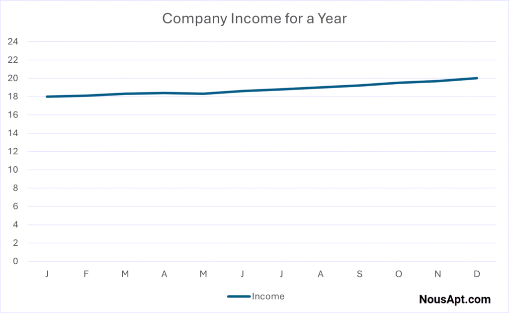
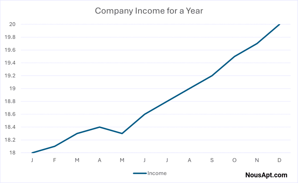
But what if the goal is to exaggerate this growth? The same 10% increase can appear far more dramatic by chopping off the bottom. A slight rise now looks like a steep climb, giving a false impression of rapid growth.

The graph can be taken further to make the modest rise appear explosive without changing the data. Just tweak the graph’s proportions. Stretch the vertical axis by making each markup stand for only one-tenth of the former figure.
Distorted Charts
Just like graphs, charts can also mislead. A proper bar chart should have bars of equal width and a consistent scale. Deceptive bar charts can mislead by:
- Making one bar wider or taller than it should be
- Using three-dimensional objects whose volumes are not easy to compare
- Chopping off the bottom to exaggerate differences
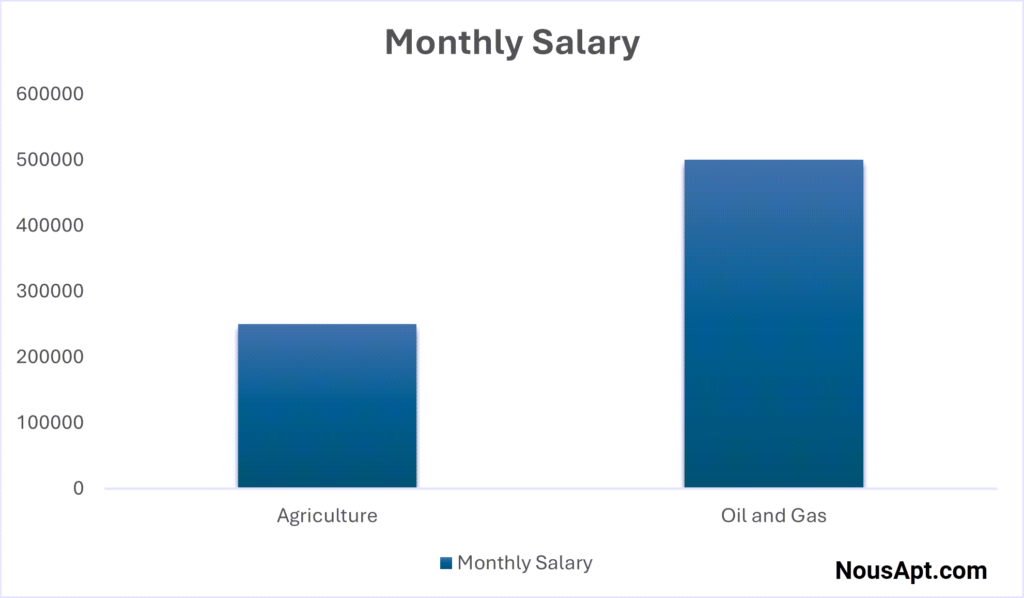
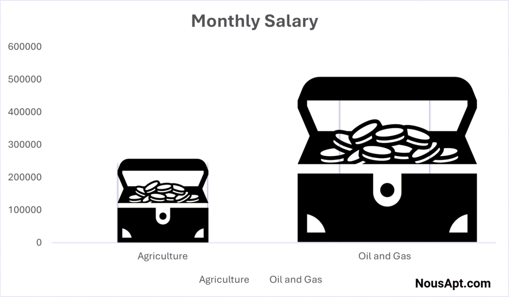
Let’s look at an example. Imagine comparing the average monthly salary of executive assistants in Nigeria’s agricultural and oil and gas sectors. The agricultural sector pays N250,000, while the oil and gas sector pays N500,000. A bar chart should accurately depict this 2:1 ratio.
But by replacing the simple bars with boxes of money and doubling the width of the higher box, the visual area increases fourfold, creating the illusion of a much more significant difference between the salaries.
So, to avoid being misled, always scrutinize the design of a graph or chart:
- Check if the graph starts at zero or if the baseline is truncated.
- Look for consistent scaling on both axes.
- Be cautious of 3D effects or disproportionate images that exaggerate differences.
- Compare the visual impression to the actual numbers provided.
Visuals can enhance understanding, but they should be tools for clarity, not deception. When analyzing a statistic, ask yourself:
Does this visual accurately reflect the data, or is it designed to persuade me of something else?
If the Data Shows Causation, Just Correlation, or No Relationship at All
We are all interested in knowing why something happened. It helps us understand our world and resolves our anxiety about why things happen. It’s just how we are wired.
So, we are tempted to conclude that one event causes the other when they are statistically correlated or associated.
But is that always the case? Sometimes, the cause-and-effect relationship is valid, but at other times, it is not.
Causation
In statistics, causation is when one change in an event directly causes a change in another event.
For example, working more days in a job that pays daily results in earning more income. This means there is a cause-and-effect relationship between the two events. And a change in one event (days worked) causes a change in the other (income).
Establishing causation between two events is challenging and requires a randomized controlled experiment. It is possible to claim a causal relationship from observational data, but the conditions are strict.
However, it’s much easier to establish a correlation.
Correlation
Correlation or association between two events indicates that the two events change together. But one doesn’t necessarily cause the other. So, with correlation, when one event changes, so does the other without any direct causal link.
For example, a belief in your ability to complete a project and actually completing it are correlated. But it doesn’t mean that because you believe in your ability (cause), it results in you completing it (effect). Other factors, such as the needed skills, time, and resources available, also contribute.
Also, we often associate politicians with a nation’s success. Politicians use this to their advantage to make sometimes unrealistic claims while campaigning. Sure, there is a correlation between a nation’s success and its politicians. But it doesn’t mean that politicians alone caused the nation’s success. Other factors also contribute to a nation’s success. Such factors include the:
- Citizens’ consensus on national development,
- Available resources, and the
- Nation’s culture of:
- Education,
- Hard work,
- Entrepreneurship and innovation,
- Competition, and
- Research for continuous upgrading.
Note that a correlation doesn’t imply causation, but causation always implies correlation.
So, an association between two factors is not proof that one has caused the other.
In his book “How to Lie with Statistics,” Darrell Huff notes the need to put any relationship statement through a sharp inspection. Consider these scenarios:
- Selective Correlation: Given a small sample and multiple attempts, you can often find correlations between unrelated things. These correlations typically disappear with larger samples or different data sets.
- Bi-Directional Relationships: Sometimes, it’s unclear which variable is the cause and which is the effect. A correlation between income and ownership of stocks illustrates this. The more money you make, the more stock you buy, and the more income you get. It’s not accurate to say simply that one has produced the other.
- Third Factor Correlations: Two variables might correlate because other factors influence both. Many medical statistics show factual relationships whose underlying causes remain speculative.
- Limited Range Correlations: Some correlations are only held within specific ranges. While rainfall correlates positively with crop growth initially, excessive rain damages crops, creating a negative correlation beyond a certain point.
Time-dependent data often shows a correlation simply due to population growth or technological advancement. So, any two sets of time-dependent data can show a correlation even if they have no relationship. Search for “spurious correlations examples” in your favorite search engine for some entertaining examples.
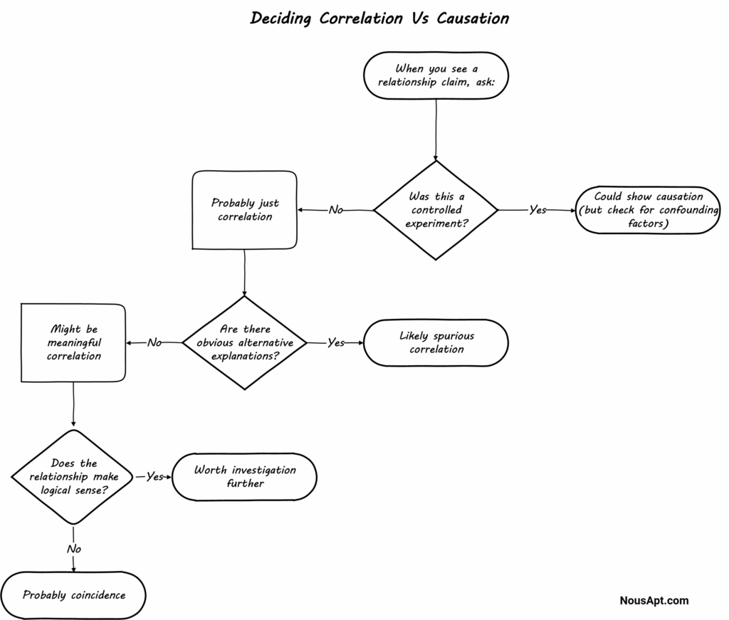
Therefore, always beware of claims of causation where there is just a correlation.
Conclusion
Remember: The goal isn’t to dismiss all statistics, but to be an informed consumer. Good statistics are transparent about their limitations. If someone gets defensive when you ask questions, that’s often a red flag itself.
The best data sources will welcome your questions because they take pride in their methodology.
If you found this post helpful, imagine how much more value you will get from it as a subscriber. Plus, you can download the post as a PDF document for printing or offline reference.
Lastly, you will love our newsletters where we share exclusive resources with subscribers. Subscription is free.
To share your views on this post, take the discussion to your favorite network. Use the share buttons below.
I am the managing director of Proedice Limited where we help organizations and individuals get remarkable results from entrepreneurship, innovation, and marketing. I am constantly learning and always looking to make a positive impact.